


Hmm, it seems as if I’ve seen this site before, except last time it was for pet supplies, not car insurance...
That’s a common sentiment these days. The infinite potential of the internet allows for unbridled creativity and individualism… so why do so many sites look the same?


The short answer is because it seems safer. Considering that 75% of users judge a company’s credibility by its website design, safer and cheaper options are not always the best options for your brand recognition. The people in charge of final web design decisions opt for “sure things” over “new things,” so they choose to copy what worked for someone else than try something different. That, in itself, is not a bad idea: better to play it safe in competitive online markets.
The punchline, though, is that the more people that adopt this strategy, the less effective it becomes. If everyone uses the same “safe” designs, those designs lose their effect and essentially become less safe. To put it another way, people are getting tired of these cookie-cutter sites; so-called “safe” web design takes increasingly more risks than original designs displaying a one-of-a-kind personality.
In this article, we explain why displaying a brand’s personality is crucial to online success, and why so many site managers resist it. In the second half, we share 7 practical, hands-on tips to better show off your personality through web design. But first, let’s start with the source of the problem: as it turns out, it stems from our own DNA...
Survival instinct in a dog-eat-dog market
Although personality seems to be personal, how it fits into your web design seems more of a business decision. It’s understood that a commercial website should serve business goals over personal goals, so it’s built accordingly.
And in most online markets, business is bloody and cutthroat. After all, your competition is just one click away, so if your website takes so much as an extra second to load, you could lose someone’s business forever.
That kind of pressure activates our survival instincts, in particular herd behavior: it’s safer to do what everyone else is doing. Or to look at it another way, those that break from the pack get eaten first.
It’s an understandable mistake; when your company is at stake, it’s better to avoid risks. Even in the absence of pressure, if studies indicate that Style A of web design works well enough, why even bother with anything else? If a blue navigation bar at the top and a picture of a 20-something on a computer has a satisfactory conversion rate (as the examples above suggest), then why waste resources experimenting on alternatives?
The safe middle ground is where the majority of people gravitate — enough to make the bell curve blush. But in web design, fear of falling behind also means being unable to break out ahead. It may keep you afloat for awhile, but can it get you back to shore?
With more and more sites entering the game every day, the same web design techniques that were once technically effective become “tired” and “bland” in the eyes of people who see them over and over. Regardless of how much they helped businesses before, at some point trend fatigue negates their initial usefulness.
But it’s not always the business managers who are at fault. Sometimes they just don’t know any better... and design agencies use that to their advantage.
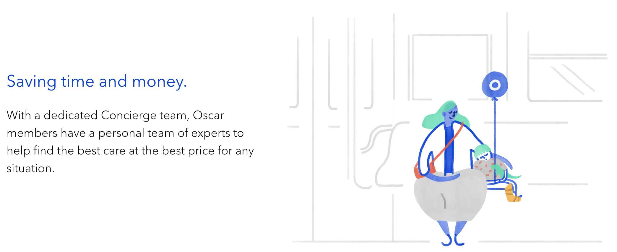
Health insurance is an extreme dog-eat-dog market and not the most friendly nor transparent industry. Oscar, fairly new to the industry and with its friendly straight forward copy, subtle animation and illustration it makes it more approachable and not scary.


“That’s not what you want. This is what you want.”
Web design, and the tech industry in general, is a bit esoteric to outsiders. For most business owners, whenever someone mentions terms like “backend support,” “customer-facing interface,” and “conversion-based UX,” their eyes to gloss over and their ears start ringing.
Company decision-makers spent their entire lives learning the nuances of business management, so it seems reasonable that they outsource these tasks to people who have spent their lives training for web design. At least it’s reasonable if they put this responsibility into the right hands. But not every web design company can deliver on what they promise.
Keep in mind that web design agencies suffer from the same fierce competition as every other online industry. They’re under sink-or-swim pressure too, and as a result they also lean too heavily on the “safe” techniques.
Whether for laziness or job security, many design agencies will simply suggest the same old strategies to all their clients. This kind of “what’s good for the goose...” mentality is largely to blame for the cut-and-paste style of web design prevalent today.
So, in the end you have businesses looking to agencies to make all their web design decisions for them, thinking they know best. But design agencies are not all equal and some have their own motives for what they pitch — motives like their own self-preservation, or simply reducing their workload by reusing previous design.
A good design agency will always work with clients and build their site around that client’s unique needs. Your website should be made on a case-by-case basis stemming from your company’s particular strengths, weaknesses, and goals. If your design agency is just pulling a preexisting strategy from their usual bag of tricks, you’re not getting the individual attention you deserve.
Similarly, DIY entrepreneurs who use template sites succumb to the same fate. Face-to-face with a blank site-builder, they’re tempted to just copy everyone else because they don’t know what else to do. Web design takes a lifetime to master; it’s a discipline that evolves every day with new technology and user expectations. In other words, you can’t just pick it up over a long weekend.
Every single business operates with their own unique set of problems, and so they all need unique set of solutions. While there are plenty of individual tactics that have been proven effective in different scenarios, there is no “one-size-fits-all” web design. No two businesses are ever the same, so no two websites should be either.
Authenticity: the best deal in town
Of course, your competitors’ mistakes are your gain. All these familiar faces in web design today create a lucrative opportunity for the brave. If you’re unafraid to go against the grain, it’s easier than ever to make a standout impression.
People today value authenticity, Millennials especially. You don’t need to look farther than the daily news to see that demand for authenticity is at an all-time high. Fake news, real scandals, and billions of people on social media shoveling the fact and the fiction together.
So put yourself in your users’ shoes. Skeptical and suspicious, you come across two sites: one that openly exhibits their personality, warts and all; and one that’s just a generic clone, putting nothing on the line. Which one would you be more likely to give your money to?
Also worth mentioning, is the internet’s affinity for niche markets. If you’re a brick-and-mortar retailer and you’re selling a low-demand specialty item — something like luxury foosball tables for example — it’ll be hard to build enough of a customer base selling only to locals within driving distance of your store.
On the other hand, if you sell online and open up your business to the tri-state area, or the country, or the entire world, then you'll have no trouble finding enough like-minded foosball fanatics to sustain yourself. The truth is, those customers are probably having the same trouble finding stores that cater to their niche as well.
The moral is, whether you’re targeting a niche or the mainstream, displaying your personality is the best way to showcase your authenticity. And with all the look-alike sites out there, authenticity could improve your business even more than better publicity or cheaper prices.
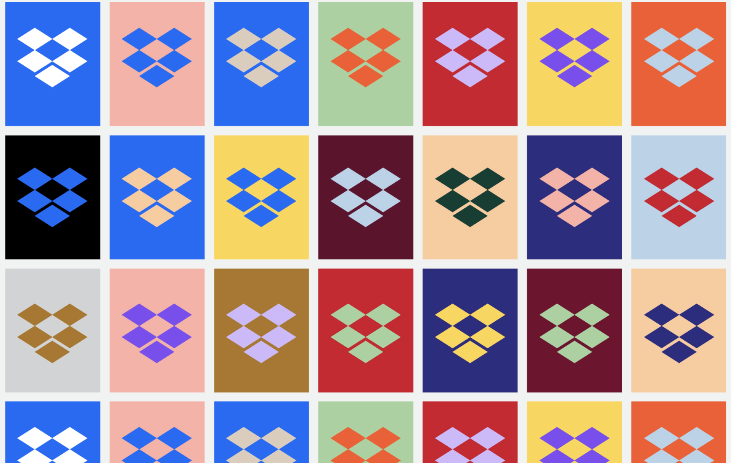
Dropbox's rebrand in 2017 sustained criticism because of its very bold and off the wall design. Negative or not - they were the most talked about! Sometimes being different can bring a lot of attention.


Seven ways to communicate your personality through web design
Now that we’ve outlined the importance of personality in web design, it’s time to roll up your sleeves and get your hands dirty. Let’s talk about what, specifically, you can do to incorporate these ideas.
For starters, you can harness quite a few different areas in web design to show off your personality. Talking about “brand personality” can be a bit broad, so let’s dissect it and clarify what components make it up. Here are the most common vehicles for displaying your personality on your site:
- Color palette. According to color theory, different colors evoke different emotions: a passionate and aggressive brand would benefit from red, whereas a friendlier brand that wants a calmer approach should use blue. Considering the scientific evidence linking brand colors to brand impressions, you’ll want to choose your site’s color palette with delicate care — ie don’t just pick your favorite colors!
- Copy: tone and voice. When visitors read the copy on your website, they develop a “voice” in their head. The style and tone of your writing, right down to each individual word, contribute directly to what that voice sounds like. Is that voice young and energetic? Wise and experienced? Or something closer to a rambling fool?
- User experience. In the tech world, the concept of “user experience” (or “UX” for short) refers to what your user thinks, feels, and, overall, experiences when they use your site. Is your interface intuitive? Or do users frequently question what buttons do? Can they find their way easily? Or do they constantly backtrack? How you design your UX says something about your brand personality — it’s the difference between offering a house guest some tea, or handing them a kettle and pointing to the stove.
- Visuals. Sight is unquestionably the dominant sense for humans, so your visuals are going to hold more weight than any other aspect. Like the overall color palette. You want to choose all your visuals with care. The kinds of photographs or illustrations you use directly influence the personality the site will exude, as do more subtle style choices like typography and whether or not to use flourishes.
- Micro-interactions. A relatively recent addition to web design (thanks to more modern tech), micro-interactions refer to those tiny little responses a site gives to some user actions. Think along the lines of an icon bouncing after you click it or a surprise animation when you hover over a certain graphic. Micro-interactions are great at “upping the ante” of your UX to keep users interested during the slower parts of the task flow.
We’ll explain the best practices for some of these below, but it’s good to know all your options are before we dive into the details. From here, we’ll discuss 7 ways you can better control how users perceive your brand personality through your web design.
1. Do you manage your data, or does your data manage you?
All these “safe” web design tactics we described above originated from good intentions — these are the techniques that analytics determined as the most successful. Web design relies on data; otherwise, our whole industry is resorted to guesswork.
Using data to make web design decisions is not the problem — in fact, we wholeheartedly recommend it. The problem is when data eclipses all other factors and accounts for all of your decisions. Formulaic methods product formulaic results, which can hold you back in a climate that favors authenticity and individualism.
Brand personalities are most effective when they develop naturally out of company culture, not when they’re manufactured artificially by the marketing department. If your “personality” stems from mechanical choices made solely by following the numbers, your visitors will immediately recognize it as inauthentic. Cold, impersonal sites like that will push them right into the arms of competitors who are more human.
Data is a powerful tool for any business, but like a false idol, it can lead you astray. Consider what the numbers tell you, but don’t follow it blindly.
2. Look at the trees, not the forest
What is a website but a combination of parts? What you see as a homepage, a web designer sees as a navigation bar, hero image, title, description, call-to-action, etc.
If you’re overwhelmed or confused, try deconstructing your website into separate parts. This lets you optimize your site from the ground up, and filters out the parts that are weighing you down. For each component, consider how it fits into to the website as a whole — what does it accomplish and is it worth including at all?
When you’ve effectively distinguished the baby from the bathwater, you can then start optimizing the individual parts. For technical elements like navigation menus, user data can reveal the preferences of your target user group — i.e., do they prefer to manually type a query into the search bar or scan a drop-down of site pages?
Breaking down a site’s design into components makes the whole thing more digestible to tech outsiders. Even if you’re hiring a design agency, this mentality is an immense help when it comes time to explain to them what you’re looking for.
It’s difficult to introduce playful elements into an experience which is otherwise very much corporate and formal. However, whenever you are designing a particular interaction, be it as simple as hovering a button, or moving from one section to another, or filling in a form, it doesn't have to be complicated it can be very simple and still make a difference.
A great way of creating a memorable experience is by adding a bit of surprise at a point where it’s least expected. Pick the most boring, rote part of the experience and infuse a little playfulness.
Check out Boden When you create an account you get to pick a title that's pretty off the wall. I've always wanted to pick a random title for my name just to be silly. With Boden, it's a reality. I mean, who doesn't want to be a Princess or a Field Marshal Lord?

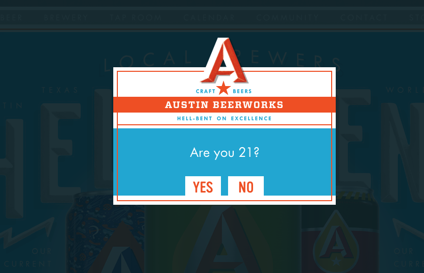
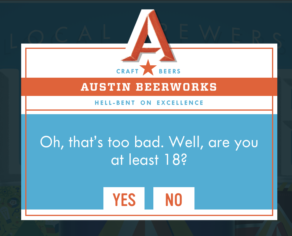
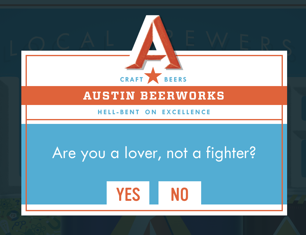
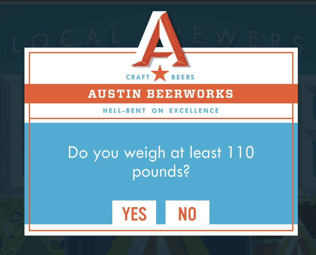
Also check out Austin Beerworks. I always show this example to colleagues because it shows humor can go a long way with a brand. I remember the time I was under 21 or under 18 and I would always lie to these types of messages. Shut up! I know you did too. Austin Beerworks actually rewards honesty! If you click "No" you can go on a "choose-your-own-adventure" trip and eventually land on a video that describes their brand personality.


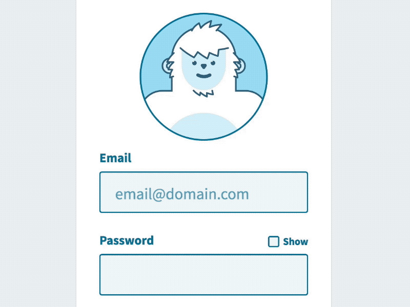
What's the most boring interaction on a website? I would say forms. As a matter of fact, you probably login to several sites every single day. It really doesn't have to be a boring experience. Look at Darin Senneff’s Yeti character!
You can really easily add a little more value to your experience just by asking yourself one question: What is one boring, predictable pattern that I can add something unexpected and unpredictable to? This doesn't mean complicating the usability, it just means adding a little bit of personality to an element that's, otherwise, universally predictable.
3. Schticks and Clones
Let’s talk about what personality in web design is not: reducing your brand to a single gimmick or just duplicating what you saw on another site. These are the enemies of authenticity — and to modern users, the most obvious warning signs.
Web design gimmicks or schticks may be impressive the first time a person sees them, but they quickly lose their efficacy when that same person sees them dozens of times. Web design gimmicks are like one-dimensional characters in bad movies — and just like in the movies, they reflect poorly on the creators.
Likewise, simply copying another site’s personality won’t work either. People have innate instincts for sniffing out inauthenticity, and even if you think you’ve covered your tracks, they’ll still sense that something isn’t right.
Besides, as we said above, every company has its own unique problems and goals. Just because a certain style works well for one company doesn’t mean it will work well for you. And who’s to say your source isn’t just copying their personality from someone else? Do you really want your online representation to be a copy of a copy of a copy?
But the real question you should be asking yourself is, why go through all that trouble to trick your visitors when it takes just as much effort to charm them naturally?
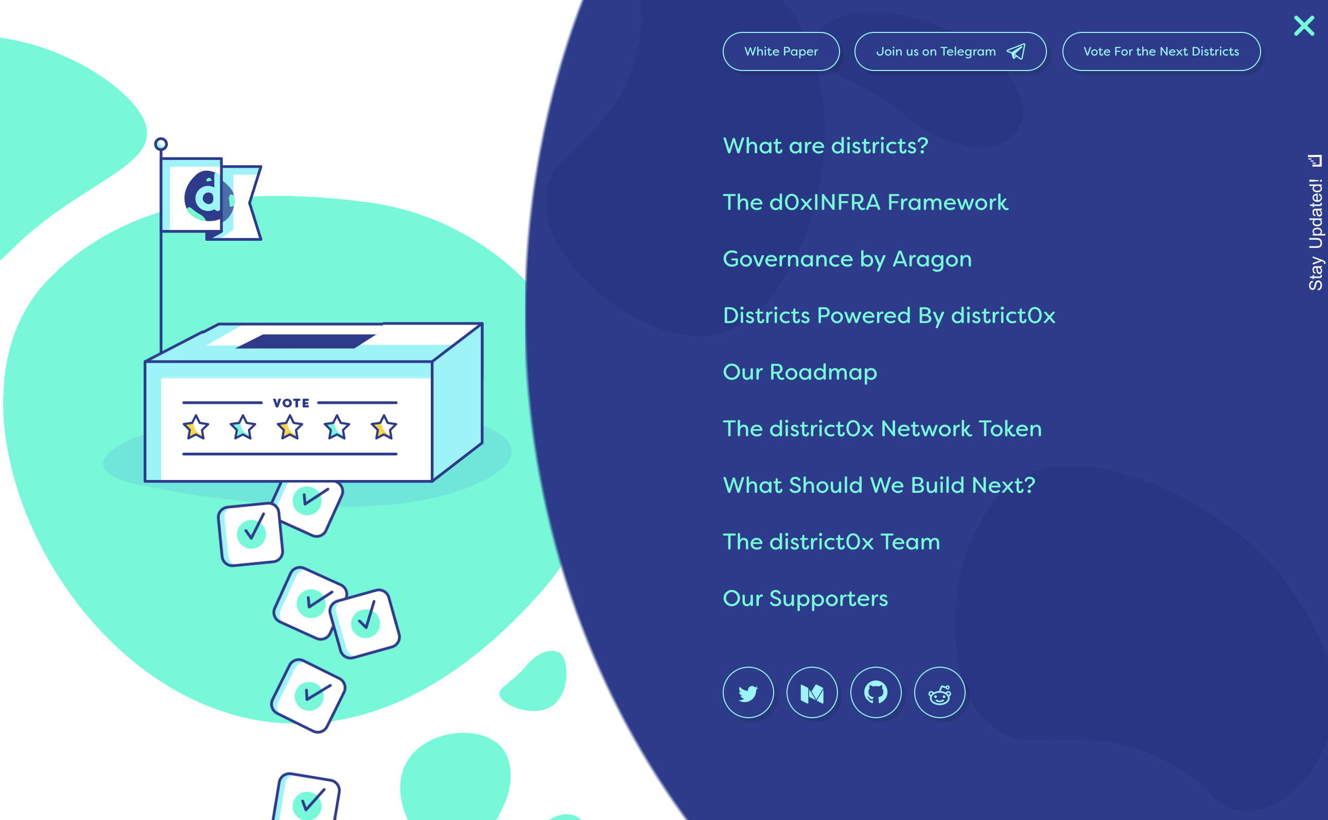
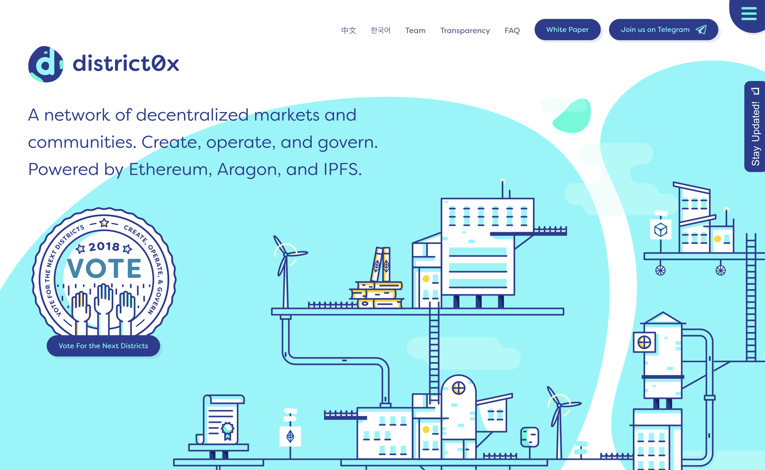
District0x is a network of decentralized markets and communities. The site uses custom shapes, smooth transitions, and animations to provide a distinct experience. No rectangles or circles. And notice how well the colors, background images, and typography work together on the site.
Waaark uses light animation when moving your cursor over different areas of the site. If all transitions were removed, the portfolio website would look pretty much like every other portfolio out there.


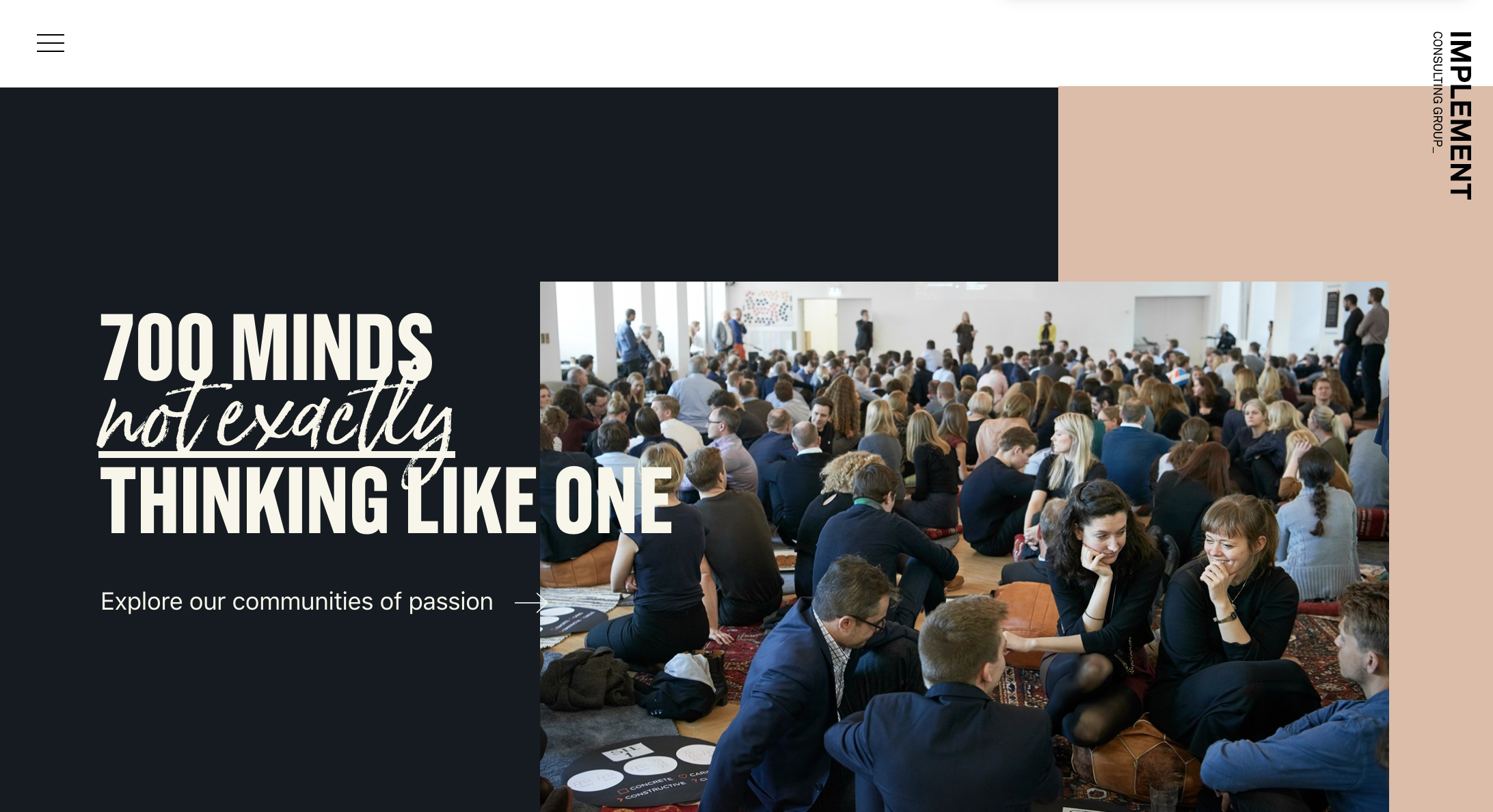
Implement Consulting Group uses short geometric animation to show their featured articles and its just enough to give the site a little personality.
4. Look the part with custom imagery
To repeat ourselves, the visuals on your site have the strongest impact on how your personality is portrayed. Stylistic choices like using artistic black-and-white photography, cutesy cartoon animals, or inky fire-breathing skulls all display greatly different personalities.
Imagery is a huge opportunity to distinguish yourself, but it’s wasted if you use stock photos and generic imagery. Seize this opportunity by being proactive in the themes you choose. It helps to be creative and show visitors a look they’ve never seen, but there’s something to be said about grounding your images in familiarity as well. In other words, think outside the box, but keep it within arm’s length.
Of course, not every company can afford custom imagery. If you have to use stock imagery, you can still modify it to make it your own. With just basic skills in a photo editor, you can apply a color overlay to stock images using your brand colors. With more advanced skills, you can manipulate the photos (if permitted in your stock image contract) to make them more personal; for example, inserting your logo onto a coffee mug.
Illustrations can work better than stock images:
Stock photos often force generic appearance into layouts, but custom illustrations give a brand a unique voice and tone. Think about replacing all the stock photos you’ve purchased with custom illustrations — you don't have to create a ton of illustrations but create just a few. This way you can come up with your own design signature specifically for your brand. Here, we will take a look at a few companies that have wonderful examples of illustrative styles applied beautifully throughout their experiences.
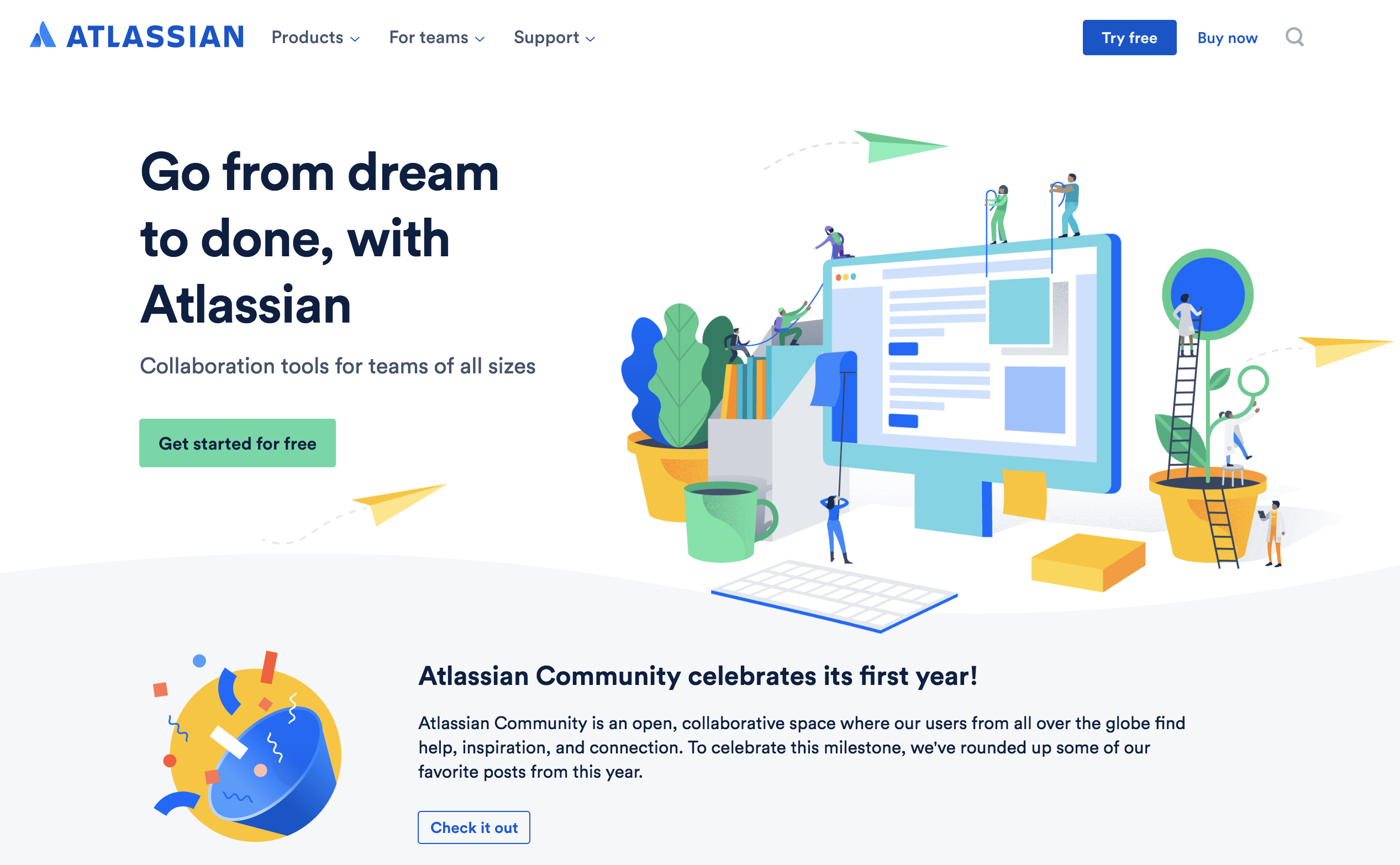
Atlassian is a great example of an illustrative style applied beautifully at every touchpoint of the experience. The illustrations are more approachable than stock photos; however, illustrations alone are not enough to stand out. Notice that they rarely appear on a plain background — they are supported by the color palette and typographic choices that complement the illustration style.
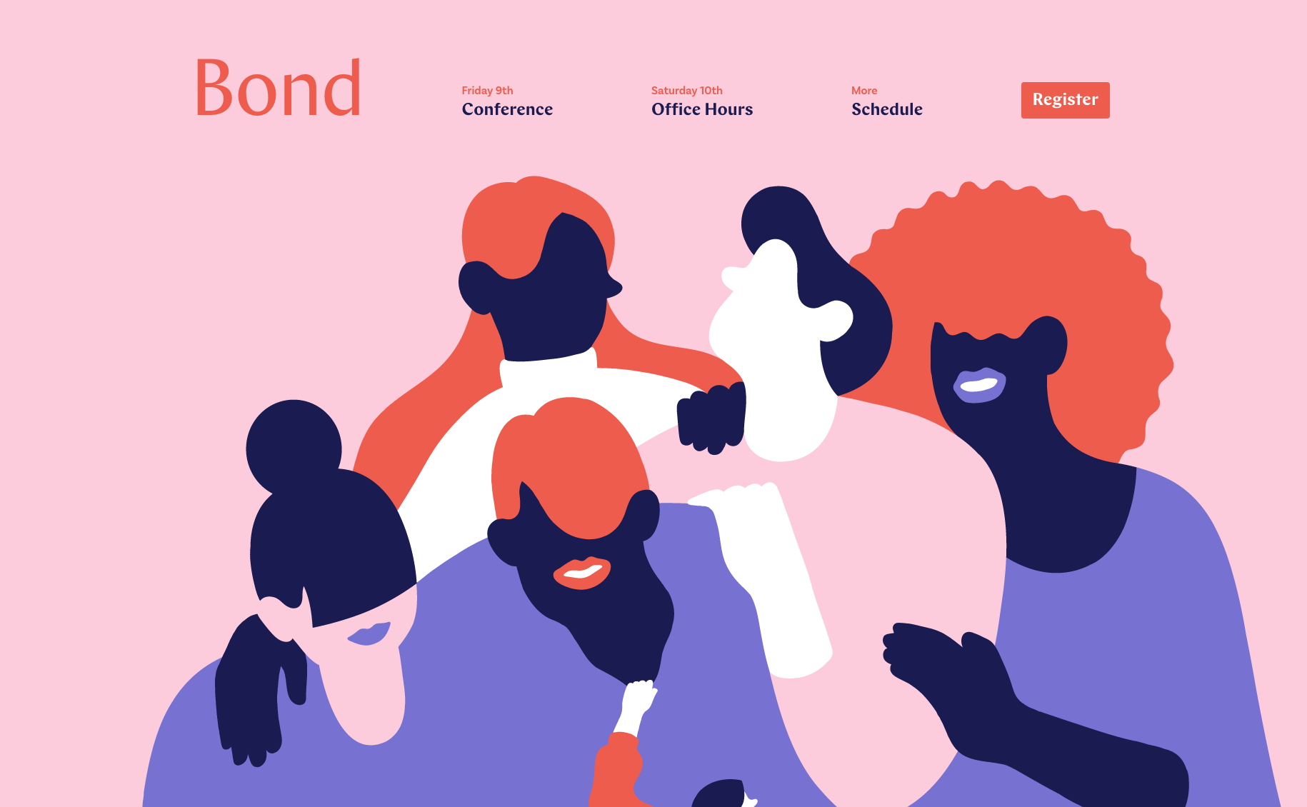
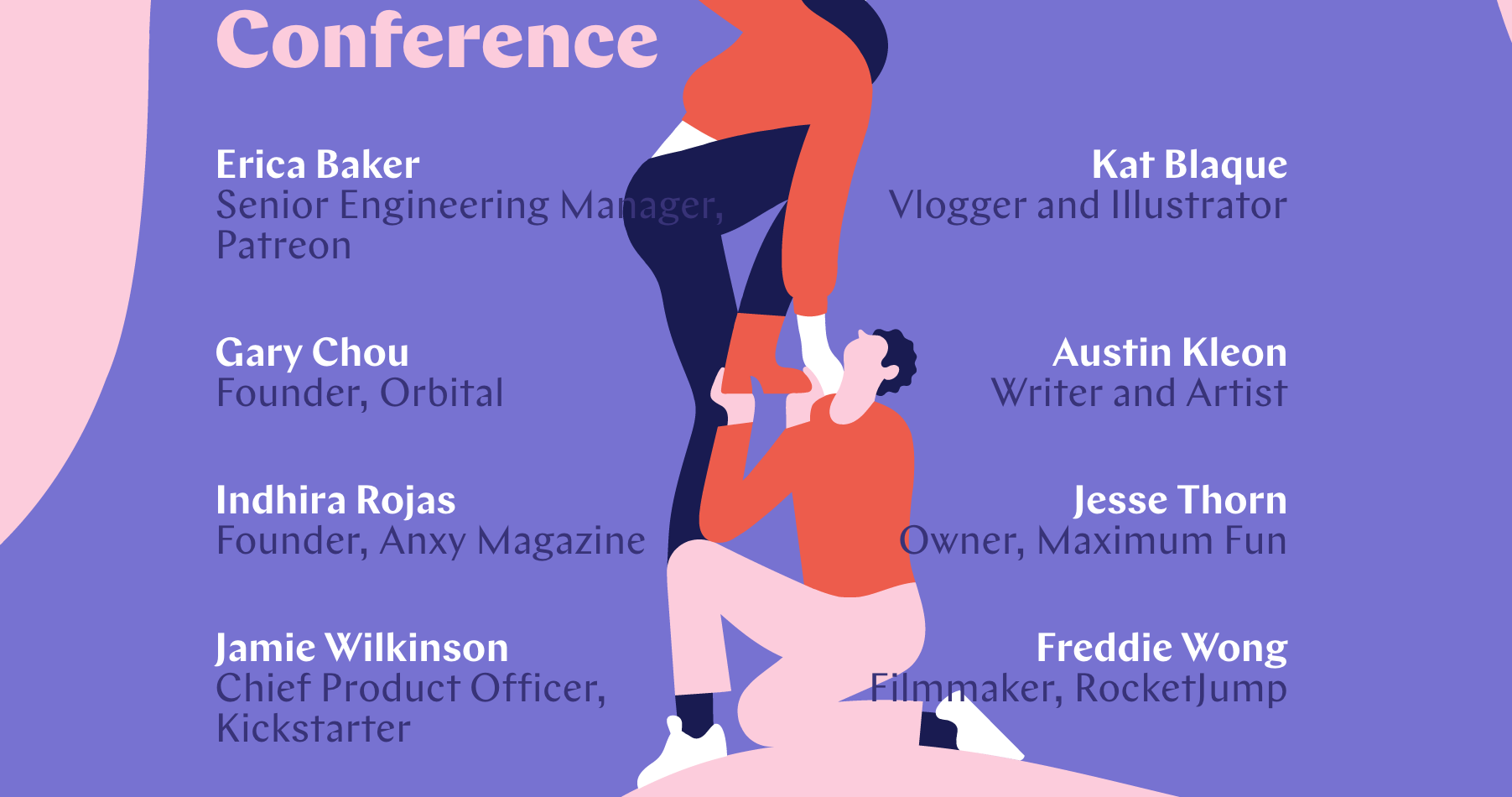
Bond is a work of art - literally. All the elements such as color, type, shapes, voice and tone play together. The illustrations are not just placed on the page as a single element but they play into the entire site as one. This site really grabs your attention.
Medium uses a weird (in a good way) illustration collage through its registration and help pages creating a unique brand experience.


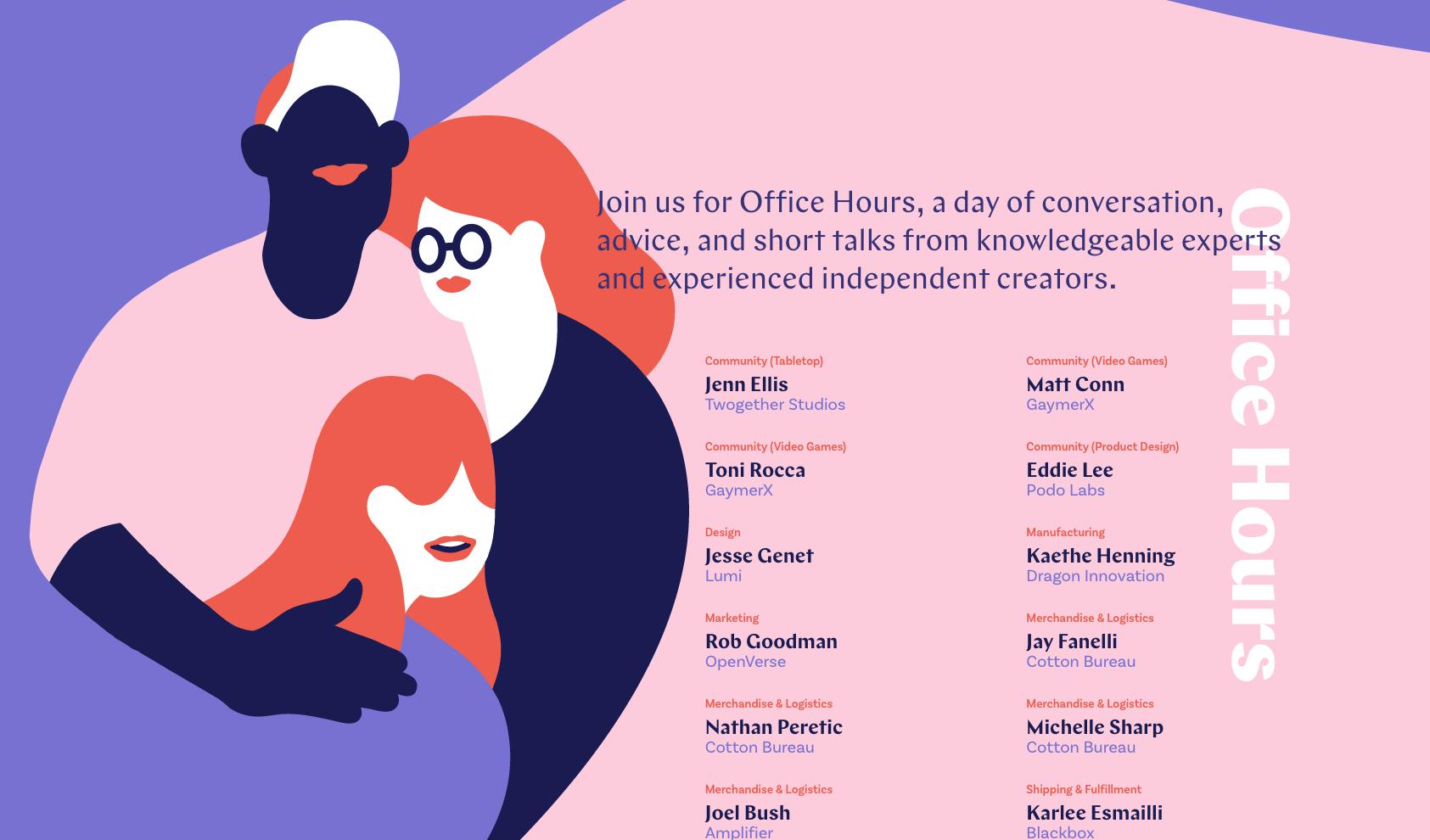
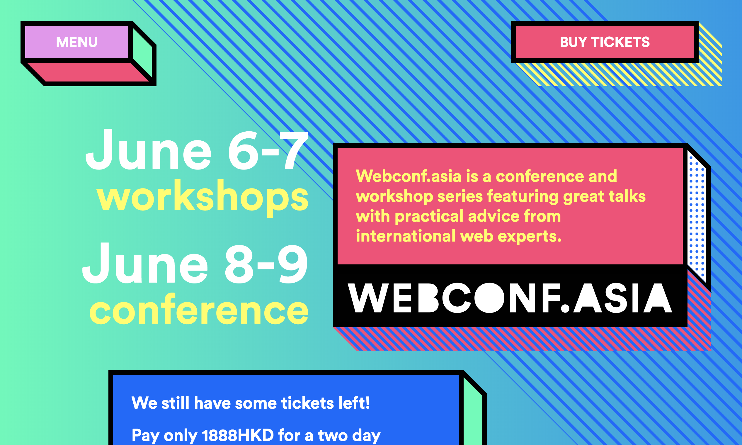
WebConf.Asia the super unique, three-dimensionality and vibrant colors of this site serve as its design signature. It is used in the speakers, talks, and main navigation pages.
5. An uncommon take on common trends
Web design trends and patterns aren’t inherently bad. More often than not, they became so common because they served a useful purpose, and both web designers and users agreed sites are better with them.
Take the classic design pattern of the upper-left hand corner logo that links back to the home page. This is something that a great majority of sites do, and each individual site reinforces the pattern’s effect on all the sites. But what’s the point? If a user is ever lost on a site, they know to click the logo to return to the home page — even if they’ve never used that site before. Design patterns are essentially interface controls that the user has already learned before visiting your site.
Repeating useful patterns won’t get in the way of your personality. But what’s better is to showcase the patterns in a way the user has never seen before. Using the logo example above, a site could exhibit their personality by adding a lively animation when the logo is clicked, or maybe a secret hover text, or maybe a sound effect — which one depends on the site’s own personality.
When using patterns and design trends, try to distill their essence instead of just dropping them in as-is. Or to put it simply, keep the aspects your users like, and change everything else.
6. Wink at users with micro-interactions
Micro-interactions are a great way to display your personality because they’re inherently "extra"; you don’t risk much by adding them because they don’t (or shouldn’t) interrupt the user’s task flow.
To help inspire some ideas, here’s a list of common types of micro-interactions:
- animations when a button is clicked
- animations with the cursor
- animated transitions during scrolls or between pages
- hover text
- hover controls
- loading screen entertainment
- sound effects
- confirmation messages
- error messages
- icon effects (like a red circle when you have a notification)
- personalized text (addressing the user directly by their name or screen name)
- easter eggs
Micro-interactions are also good because they tend to be unexpected; it adds to your user’s delight when they’re surprised. This is fertile ground for displaying your sense of humor — a favorite for charming new visitors — or even flexing your design muscle with some next-level visual effects.
MailChimp’s interaction design just before and just after an email campaign is sent out.


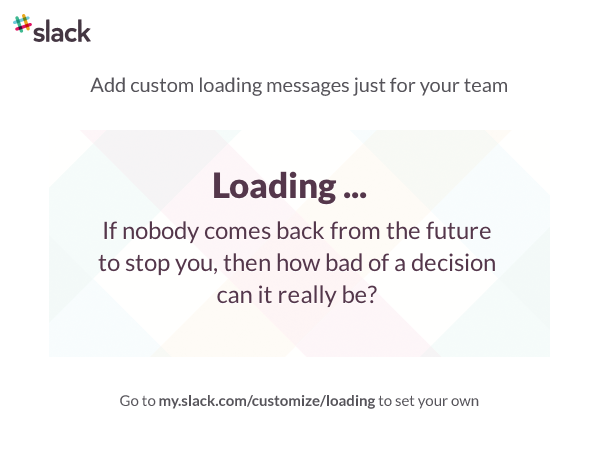
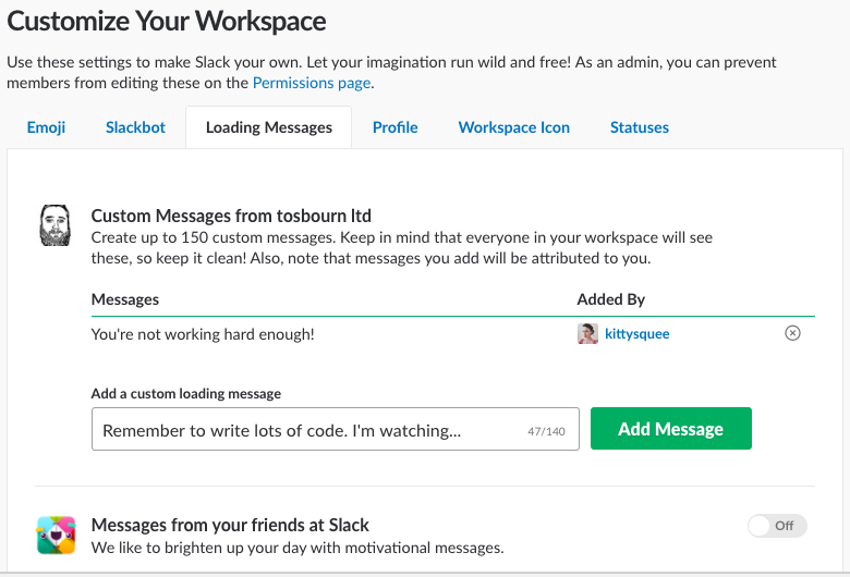
Slack’s loading messages reflect the personality of the brand and the people working there. That’s the power of copywriting at play.

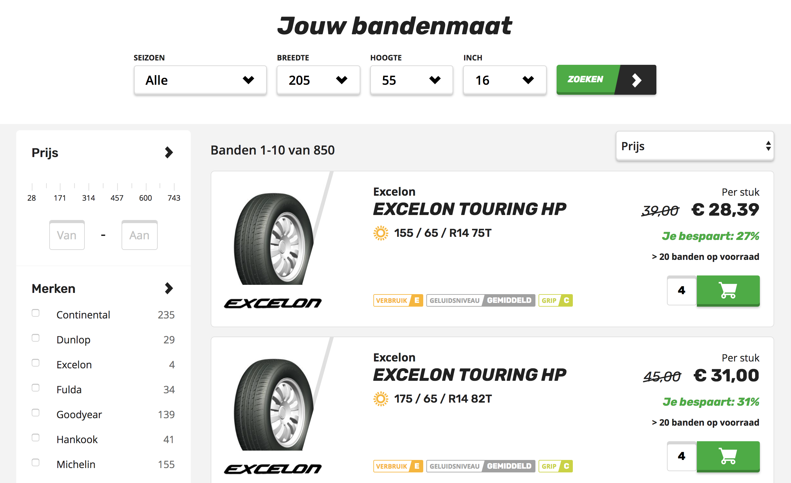
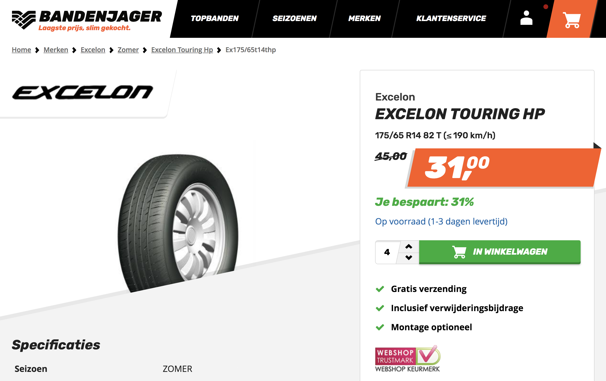
Bandenjager's design signature is the use of slanted shapes and typography on their site. From buttons, inputs, images and even their navigation this is consistent - even down to the smallest micro-components. It makes this brand really stand out.
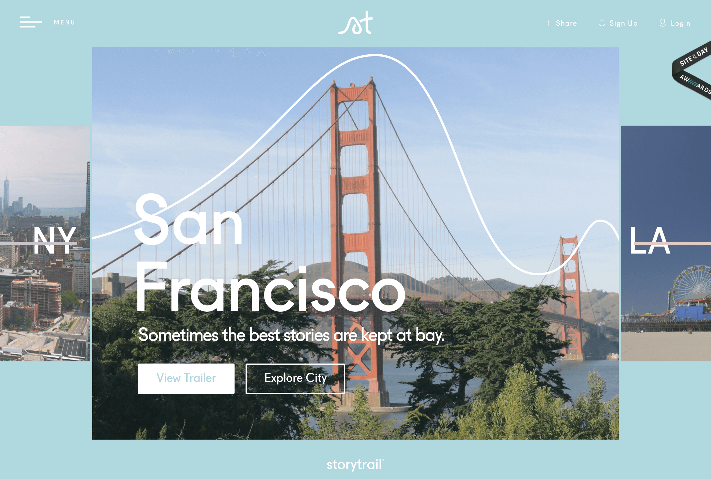
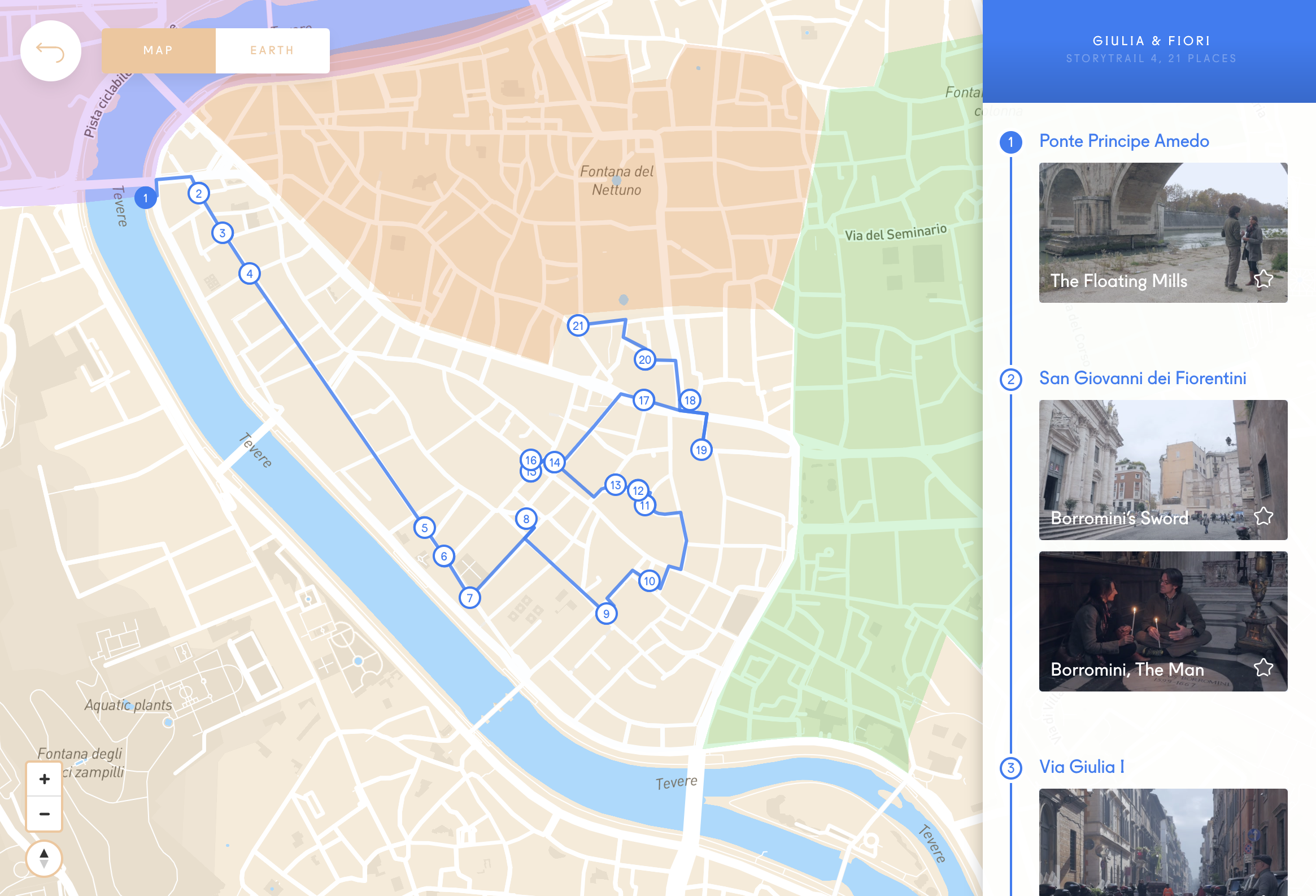
Storytrail is a pretty cool site letting people explore different cities interactively using photos and video. The cities have their own unique brand signature which is outlined using a graphic line showing its landmarks. They use the signature for animations, transitions, and arrangement of items in the layout.
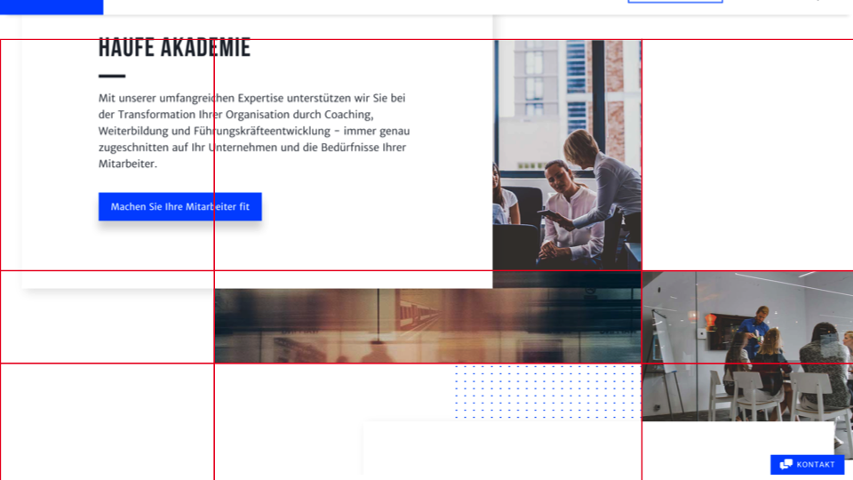
Haufe has overlapping elements which provide some nice dynamics to their otherwise corporate grid. The main structure of the grid is derived from the letter H, which is the main character of the company’s identity.

When considering the visual direction of a site, it’s a good idea to consider custom illustration style, backgrounds, typography, and shapes. Establish strong connections between all of these attributes by reiterating design decisions, such as the choice of colors and spacing. While doing so, of course, it wouldn’t hurt to avoid predictable options used widely everywhere else. One of the effective ways to achieve this is by keeping tabs on on-going design trends, then pick the most prevalent one and nail it.
Just keep in mind what we’ve been saying about personality and choose micro-interactions that suit what you’re going for.
7. Form follows function
Last but not least, we need to make something clear: as important as showing off your personality is, it should never get in the way of site functionality. A bland site that works is still preferable to an entertaining site that doesn’t.
For this reason, it’s best to communicate your personality in ways that won’t inhibit usability. Before you add anything, ask yourself what you gain and what you lose. If it shows your brand personality without affecting how people use your site, you’re good to go!
Your brand personality consists of style choices; if these choices ever conflict with functionality, then functionality should always take top priority. A standard example is high-quality pictures and their effect on load time. Of course you want the best-resolution photos for your site, but HD photos require more data, which slows down load times. In effect, you have to find the right balance between the two, always erring on the side of functionality.
Conclusion: The least painful option
Good web design is never easy, even for the experts. That’s why most businesses choose the “least painful option” of hiring a design agency — still painful, but not as much as doing it yourself.
As we said before, though, you’re right to be suspicious of design agencies. If they seem to be pushing the same cavalcade of tired and worn-out ideas, they’re not giving you the individual attention you deserve. Judging by the volume of clone sites out there, this type of design agency seems to be thriving.
That’s exactly what Matthew Beasley is out to change. As a designer, I respect the significance of a brand’s personality. I don’t think it should be shaped by data — in fact, when handled properly, a brand’s unique personality is its greatest business tool. My expertise lies in my breadth of skill. I can match the perfect design trend to fit your personality, organically. That’s the best of both worlds: data-driven site mechanics, but with a stylistic spin that’s distinctly you.
Matthew Beasley can handle everything from design, coding, management, maintenance, security, and even hosting. Take a look around my site and see what I can do for you, and get started now.
Credits: Special thank you to my fellow designer and editor Quinn Bookalam for editing this blog!
Posted on
February 25, 2019


Designer that focuses on bring personality & user experience back to the web.
© Matthew Beasley